6 Proven Tactics for Generating POS Leads
August 13, 2013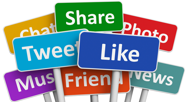
Social Media Tips: 5 Ways to Increase Your Following
August 14, 2013
It takes less than two-tenths of a second for an online visitor to form their first impression of your brand, according to researchers at the Missouri University of Science and Technology. And in just another 2.6 seconds, their eyes have concentrated in a way that reinforces that impression.
 To make the most of those milliseconds: decide what you want to say, who you want to say it to, and how you’re going to say it. To do that, think about how you want your target audience to perceive you. Choosing the right fonts, colors, logos, photos, videos, etc. can make all the difference.
Here are five helpful hints about how to make a great online first impression to your site visitors:
1. Branding
Visitors spent about 6.48 seconds focused on the logo – longer than any other aspect of the page, according to the study. Consumers are starting to spend more and more time researching and reviewing companies before making purchases, so they often make assumptions or judgments about your professionalism by the look and feel of your website. But before even thinking about your web design, you should have a catchy name and tagline, an eye-catching logo and a simple URL. When it comes time for the design: the simpler, the better. Why? Clutter is confusing. You should be able to communicate your message to visitors within a few short seconds, or however long it takes for them to form an opinion.
You should also spread your brand through social media sharing and following widgets. Participants in the study focused on social media icons for 5.95 seconds. These show that you are up-to-date technologically and that you encourage your visitors to engage with you through multiple channels.
2. Colors
Think about your favorite logos, designs or advertisements. What colors do those companies use? What impression do they make? Colors can make your site visitors feel a certain way about your company based on the archetypes associated with them. For example:
Red – action, passion, aggression
Orange – energy, friendliness, confidence
Yellow – positivity, motivation
Green – nature, serenity
Blue – dependability, strength
Purple – creativity, mystery, royalty
Pink – femininity, romance, excitement, youthfulness
Brown – nature, strength, dependability, simplicity
3. Photos and videos
In the study, visitors viewed the main photo or graphic on the page for 5.94 seconds. Above the fold of your homepage, use large, high-quality photos and videos that demonstrate your company’s personality or give insight to your culture. Photos that are too small or too grainy could affect the way visitors perceive your professionalism. You could also include individual staff headshots, group photos or even a photo gallery. This helps people put a face with the product. Without photos of real people, they may think you’re some sort of scam. For extra personality points, use an introductory video on your homepage.
4. Language
What phrases do your prospective customers use when talking about their frustrations and challenges? What is their tone? Do some shopping around: you can pick up on this by reading social media posts, blog comments, emails, forums, etc. You could even conduct a focus group to find out. By using the right language, you are making your content relatable to your target audience. When your prospective customers visit your site for the first time, they will feel like they’re talking to someone who understands their needs. Also, use consistent styles, typefaces and logos across your content to reinforce your professionalism.
OK – you’re ready. Now go knock the socks off your site visitors on the first try! If you do, do everything you can to reinforce their positive first impression in all of your future communication. And if you don’t, remember that you can always work to improve a negative impression.